
Looker Studio Explained Simply — Turning Messy Data Into a Clear Dashboard
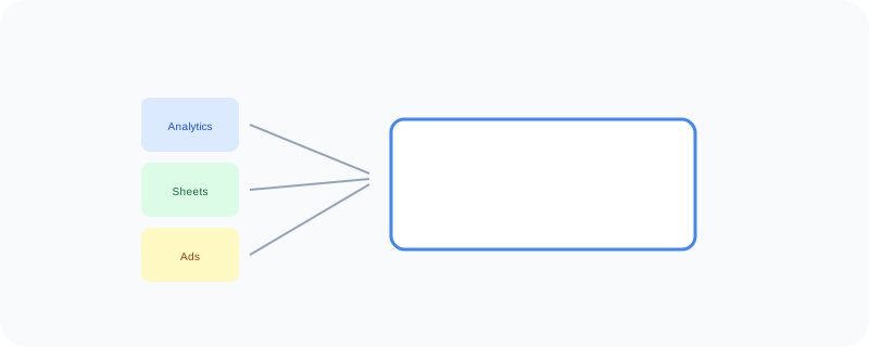
Looker Studio pulls data from places like Analytics and Sheets and turns it into a free, shareable visual dashboard.
🌐 Translate this article:
⚡ Powered by Google Translate · Original content preserved
Numbers scattered across a spreadsheet, an ads account, and an analytics tool don't mean much on their own. Looker Studio pulls them together into one dashboard that's actually easy to read.
What It Actually Does
Looker Studio, formerly called Data Studio, connects directly to sources like Google Analytics, Sheets, and Google Ads, then lets you drag and drop charts and tables to build a visual report. Instead of a static screenshot, the dashboard updates live as the underlying data changes, so you're always looking at current numbers.
What You Can Actually Do With It
- Connect directly to Analytics, Ads, Sheets, and other data sources
- Build reports with drag-and-drop charts and tables
- Share a live, always-updating dashboard instead of a static file
- Combine data from multiple sources into one unified view
Who Is This For?
Business owners and marketers who want a clear view of their numbers without a paid analytics tool. Teams who need to share performance reports with people who don't have direct access to the raw data.
How to Start Using It
- Go to lookerstudio.google.com
- Create a new report and connect a data source
- Drag charts and tables onto the report to visualize the data
- Share the report link with your team or clients
A Simple Way to Think About It
Think of it as taking several separate spreadsheets and stitching them into one clear picture that updates itself automatically.
Want to see more Google marketing tools? Browse the full Google Universe directory, or read our simple guide to Google Ads next.
📣 Share this article